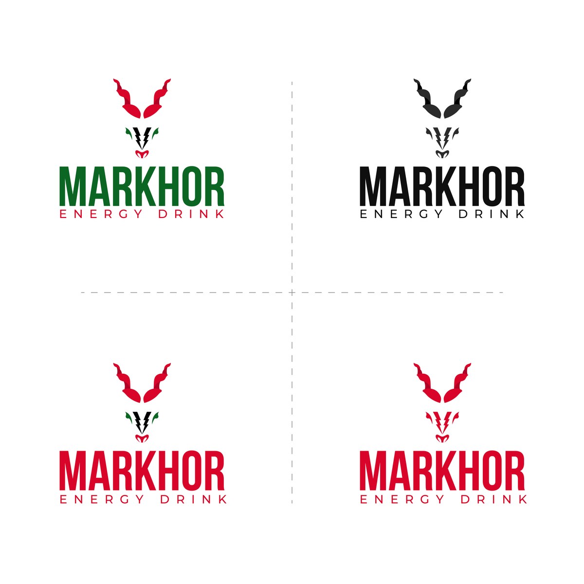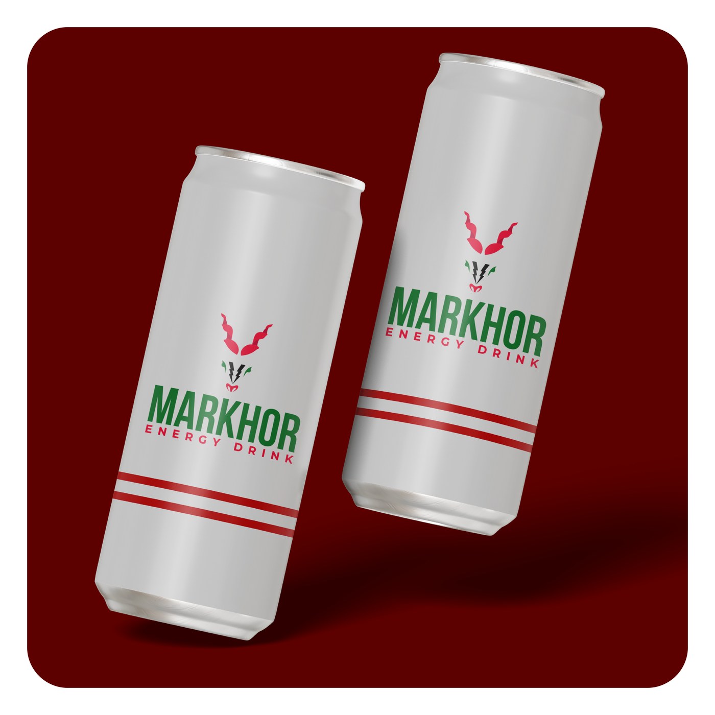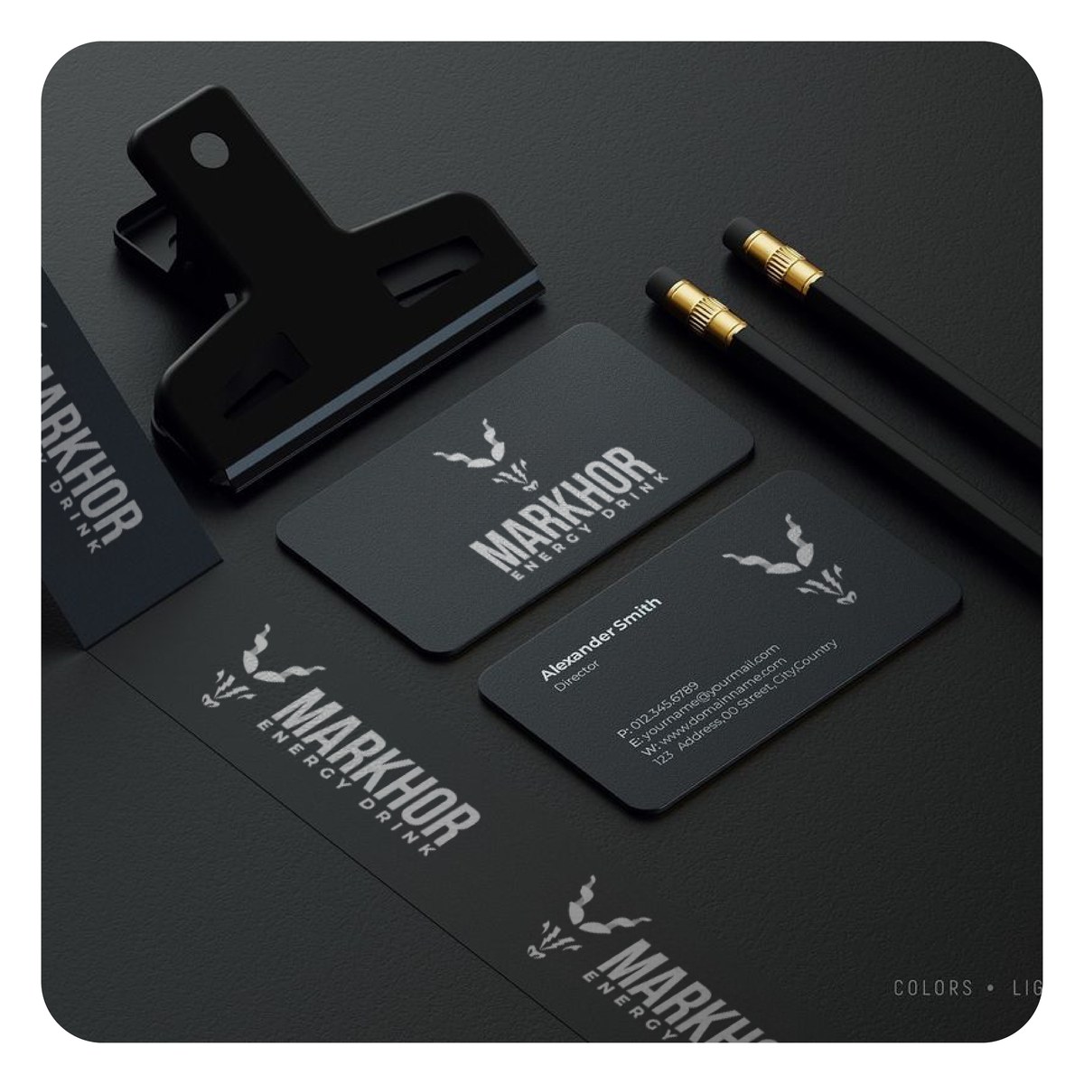
Markhor Energy Drink ran an open design contest for its brand identity, with a large field of entries competing for a single mark. The brief called for an icon built around the markhor, the animal, that could carry the brand's national identity and energy-category cues at once, and read clearly reduced to the size of a can label.
This submission was selected as one of 10 finalists out of the full field, a genuine result in a competitive open contest, though it was not the entry the client ultimately put into market. The case study below reflects a finalist submission, not the brand's official, in-market logo.
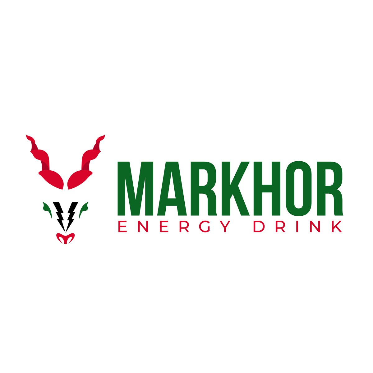
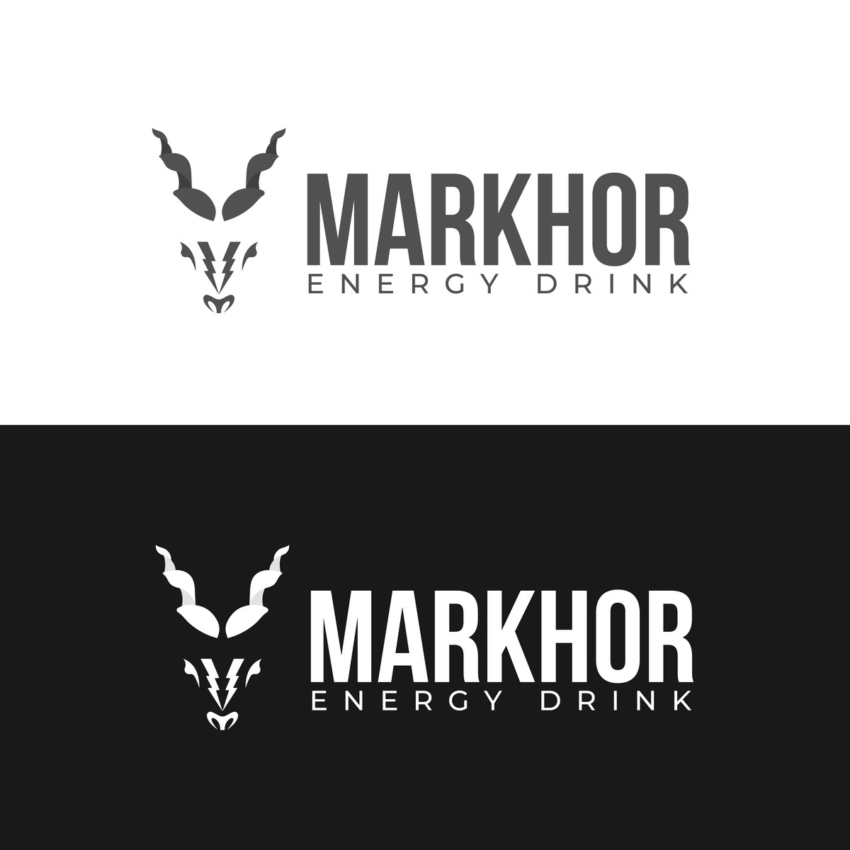
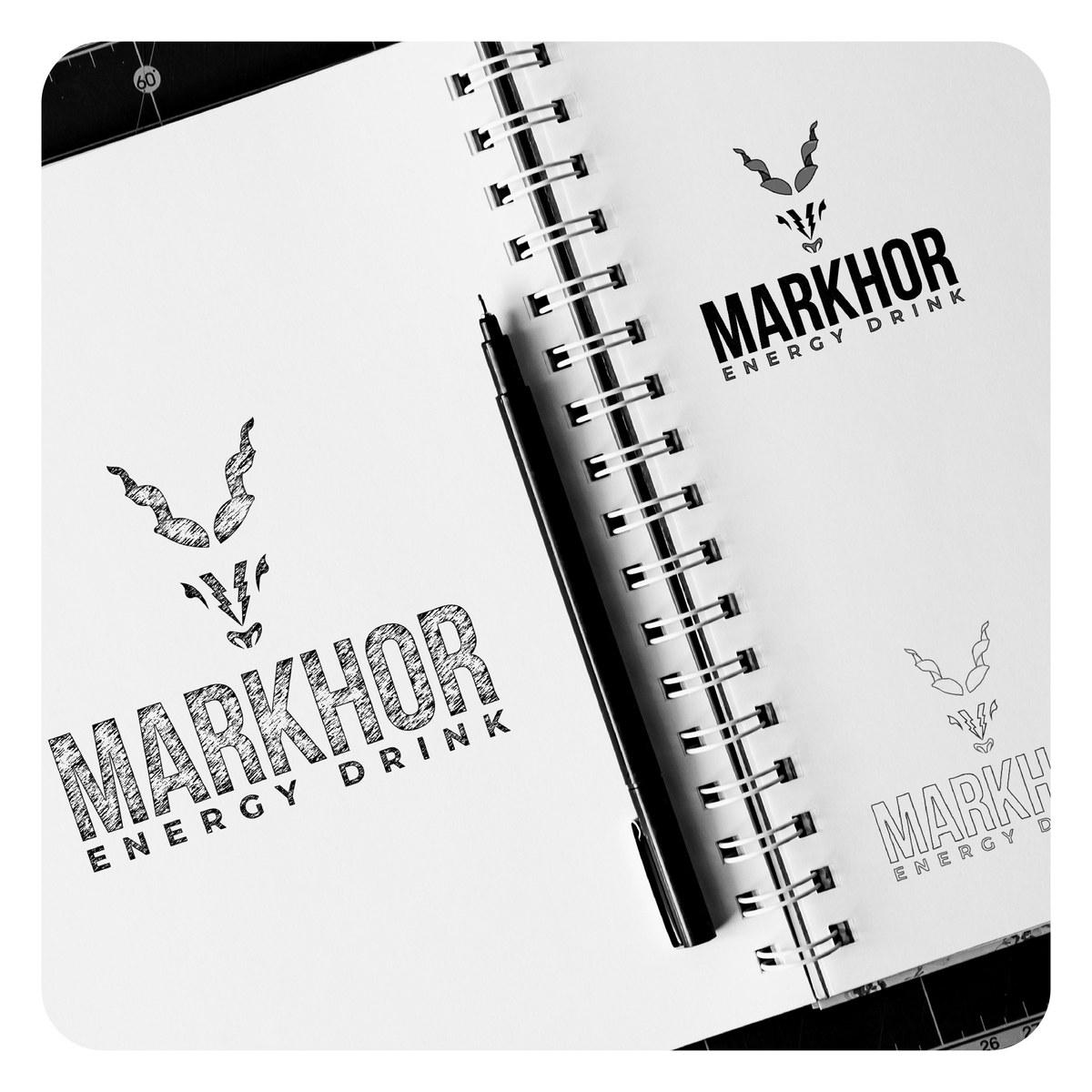
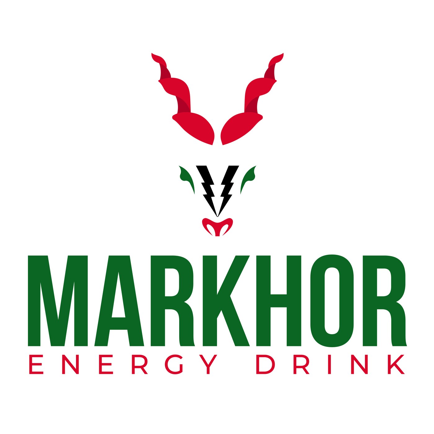
The markhor's coiled horns anchor the icon at a glance, paired with a lightning bolt worked into the muzzle to signal the energy category without adding a separate symbol. Green and red carry the national color association the brand leans on, with black-and-white and reversed variations built alongside so the mark still reproduces cleanly wherever a two-color print isn't an option.
A bold, condensed wordmark sits under the icon in both a stacked and a horizontal lockup, so the system could flex between a can label, a business card, and stationery without redrawing anything.