Home About Services AI Automation Portfolio Contact
Logo & Brand Identity · Food Delivery

Zar Rasha

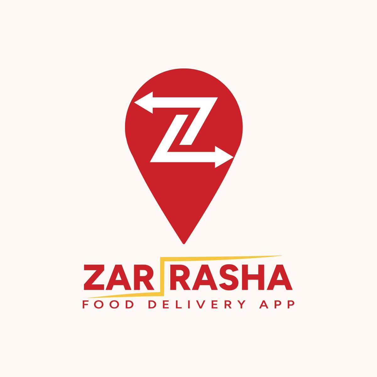
A location pin fused with a bold "Z" and a directional arrow, built to say speed and delivery reach before a customer reads a single word.

ClientZar Rasha
RoleLogo & Brand Identity
IndustryFood Delivery App
DeliverablesLogo, Palette, Typography, Applications
Logo Design Brand Identity Food Delivery
Zar Rasha logo lockup on red background
Challenge

Food delivery apps live and die by a glance, a customer scrolling a crowded app store or a driver's bag spotted across a parking lot. Zar Rasha needed a mark that read instantly as "delivery" without leaning on the same pin-and-fork clichés every other app in the category already uses, and one that still held its shape reduced to an app icon.

Solution

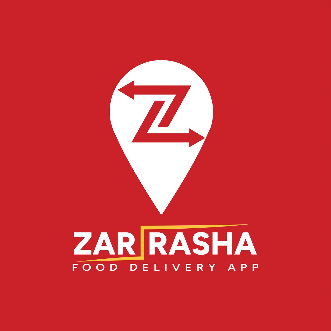
The mark sets a bold "Z" inside a location pin, built from two opposing arrows so the same shape reads as both a place and a route. It's a mark that does two jobs at once: it says "Zar Rasha" and it says "on the way" in the same silhouette, no separate delivery icon required.

A confident red carries the appetite and urgency the category runs on, backed by white for contrast and a gold accent, drawn as a lightning-bolt divider through the wordmark, that signals speed without needing its own icon. A clean, geometric sans wordmark sits underneath, direct and easy to read at a glance.
Logo System

One mark, built to run on red or cream.

The full-color lockup on the brand's primary red, and a reversed treatment for lighter packaging and print.

Zar Rasha logo lockup on red background
Primary, on red
Zar Rasha logo lockup on cream background
Reversed, on cream
Color Palette

Appetite and urgency, with a signal of speed.

Three colors, easy to specify correctly on a packaging order or a print run.

White #FFFFFF

Carries the mark and wordmark on the primary red, keeping the logo legible at any size.

Red #C82128 RGB 200, 33, 40

The primary brand color, chosen to signal appetite, energy, and urgency across the category.

Gold #F7C63C RGB 247, 198, 60

An accent used sparingly, most visibly as the lightning-bolt divider through the wordmark.

Typography

A geometric sans built to read fast.

Figtree carries the wordmark and every headline across the guidelines, in Bold for weight and Regular for detail.

Figtree Bold

Primary display weight
A B C D E F G H I J K L M N O P Q R S T U V W X Y Z
0 1 2 3 4 5 6 7 8 9

Figtree Regular

Text & supporting weight
A B C D E F G H I J K L M N O P Q R S T U V W X Y Z
0 1 2 3 4 5 6 7 8 9
Mockups & Applications

Tested on the bag, not just the deck.

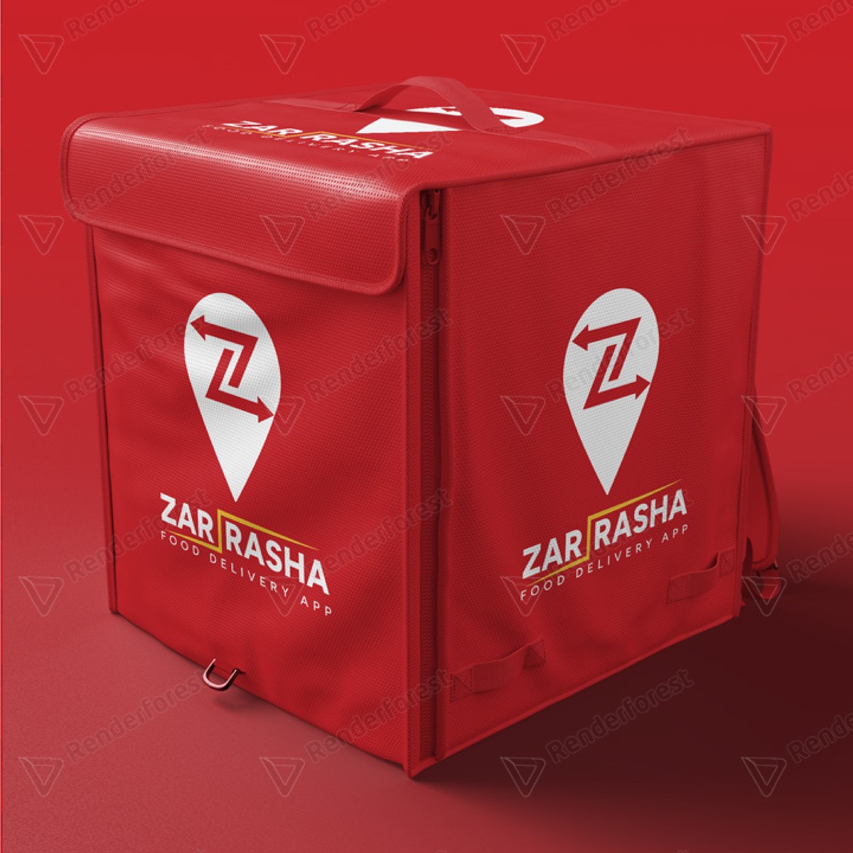
The mark applied to print, delivery packaging, and fabric, the surfaces a delivery brand actually lives on.

Zar Rasha logo on a delivery box
Delivery box packaging
Zar Rasha logo on a print mockup
Print application
Zar Rasha logo on fabric material
Fabric application
Zar Rasha logo on fabric material, alternate view
Fabric application, detail
Process

Discover

Brief centered on standing out in a category crowded with generic pin-and-fork marks.

Design

Pin, "Z," and arrow fused into one mark, with the color palette and wordmark built alongside it.

System

Typography and both color modes documented so the mark stays consistent everywhere it lands.

Apply

Mark tested across print, delivery packaging, and fabric before handoff.

Results

The result is a single mark Zar Rasha can run on a delivery box or an app icon and have it read as speed and delivery every time.

2Logo color modes
3Core brand colors
4Real-world applications

Building an app brand that needs to read fast?

Start a project