A complete visual identity for a trusted local hardware and construction supplier, built to carry its reputation onto packaging, uniforms, signage, and every touchpoint as the business scales beyond word of mouth.
Lala G Traders had spent years earning trust as a local hardware business, quality tools, construction materials, and household essentials sold on reputation and repeat customers. But as the business set its sights on a broader market, from contractors and homeowners to industrial clients and retail traders, it had no visual identity to match. There was no mark that could scale onto a shipping container, a safety helmet, or a business card and still look like it belonged to the same company.
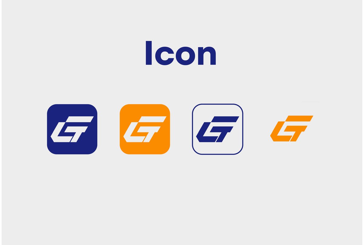
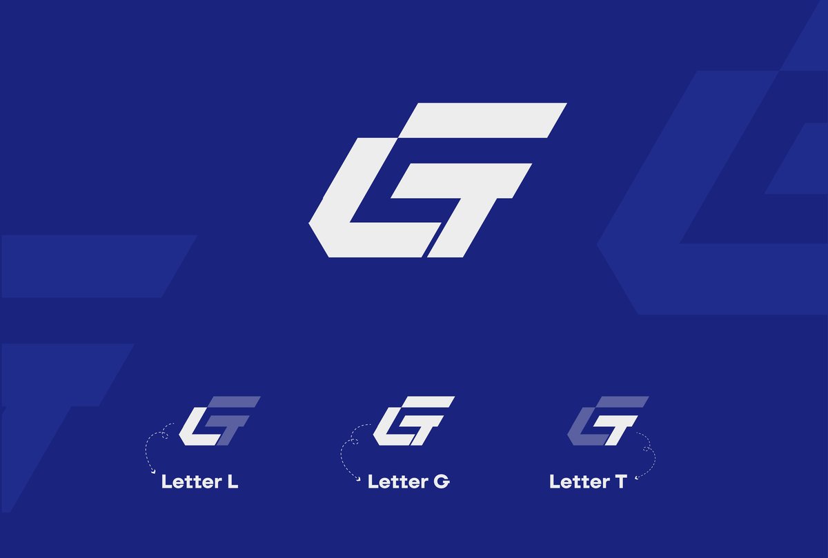
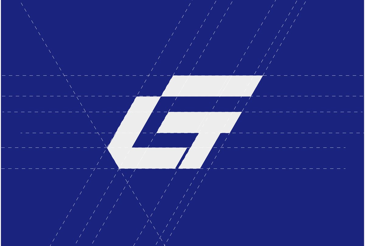
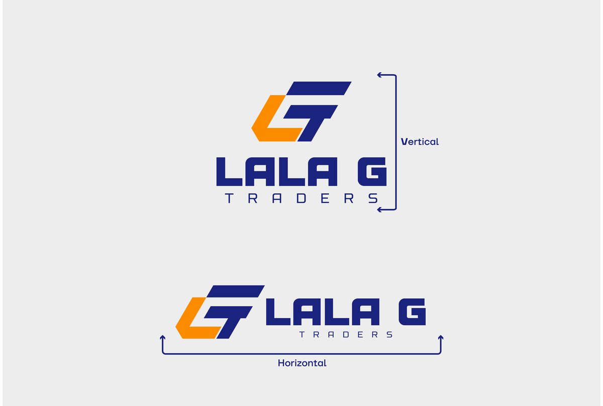
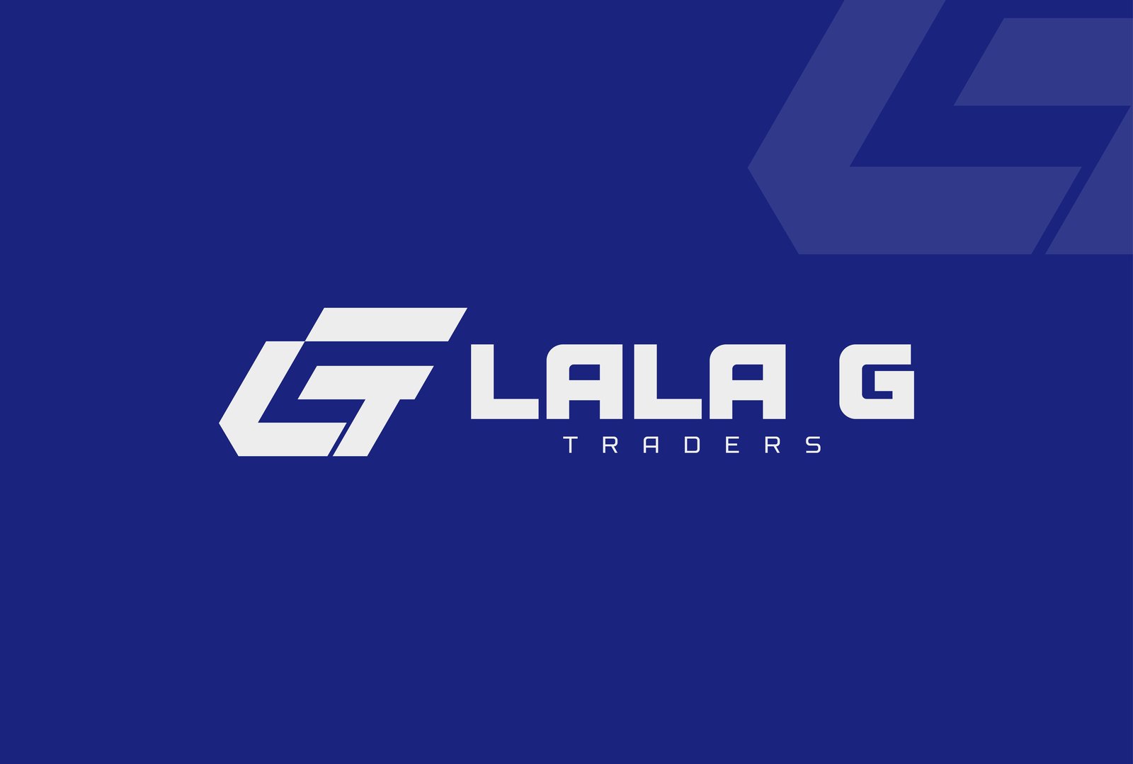
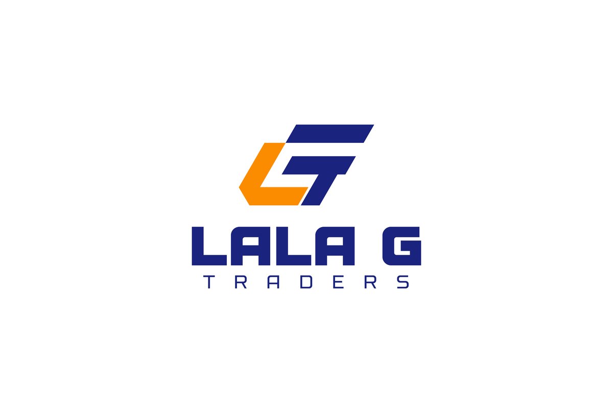
The mark reduces "Lala G Traders" to its own initials, L, G, and T, interlocked into a single angular monogram that reads as a bold, industrial "G" at a glance. The construction is entirely geometric, built on a strict angle system, so it holds up at the size of a favicon or the side of a forty-foot container without losing its edges.
An indigo blue carries the weight of trust and professionalism across the wordmark and stationery, while a single stroke of orange in the monogram signals energy and action, the moment where the brand steps forward. Bold, condensed typography reinforces the same idea in text: solid, confident, built for a trade that works with its hands.
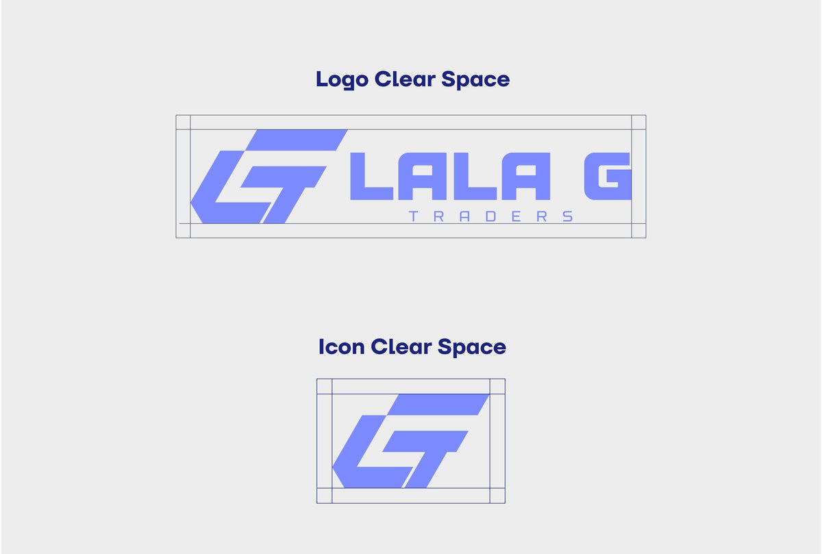
Construction, clear space, colour variations, and lockup rules, documented so the mark stays consistent from a business card to a warehouse wall.


A deliberately small palette, easy to specify correctly on a sign painter's order or a print run, hard to get wrong.
A deep navy that symbolizes trust, reliability, and professionalism, ideal for establishing a confident brand presence.
A bold, energetic orange representing strength, enthusiasm, and action, used to draw the eye while staying warm and approachable.
A neutral backdrop that keeps stationery and signage legible, letting the blue and orange carry the brand's energy.
Lustra Black carries the wordmark and every headline across the guidelines, chosen for its density and confidence at a distance.
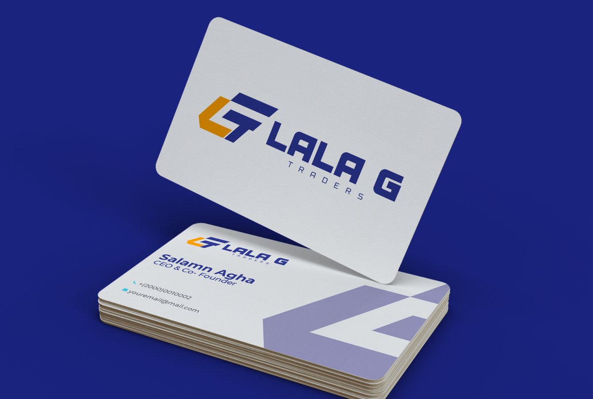
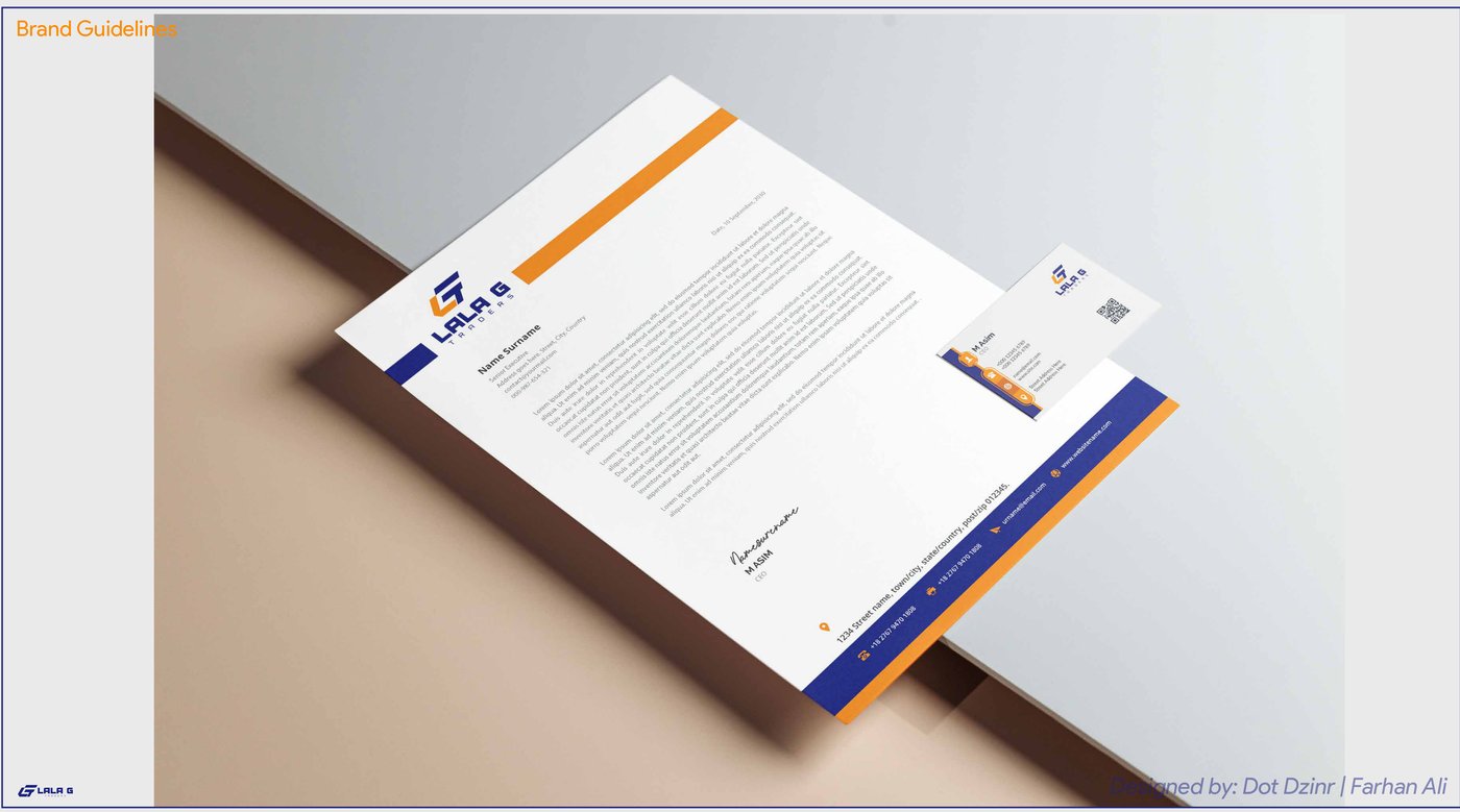
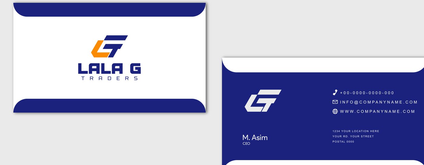
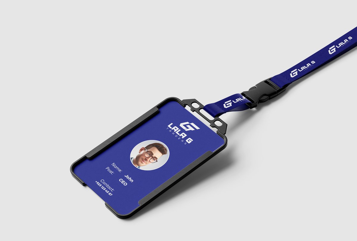
Business cards, letterhead, envelopes, and ID credentials, the everyday paperwork that carries a brand's first impression.


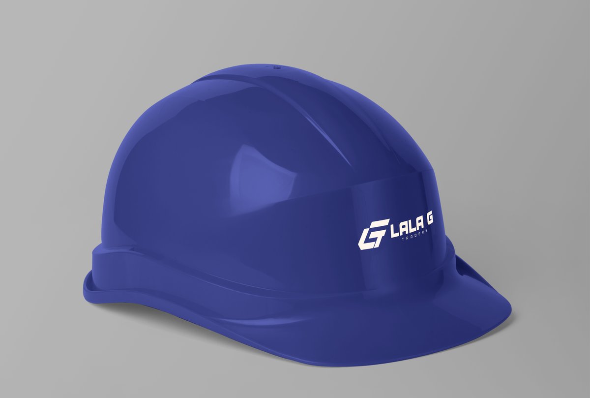
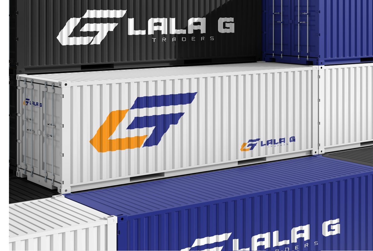
The mark tested across the surfaces a hardware brand actually lives on, from a safety helmet to a shipping container.


Brand overview, mission, vision, and target audience workshopped with the founders, from contractors and homeowners to industrial buyers.
The L, G, T monogram developed on a strict angle grid, tested at favicon size and at container scale.
Palette, typography, clear space, and misuse rules documented into a 30-page brand guideline.
Stationery and real-world mockups produced so the team could see the brand before it went to print.
The result is a complete, self-contained identity system Lala G Traders can hand to any printer, sign shop, or uniform supplier, and get the same brand back every time.