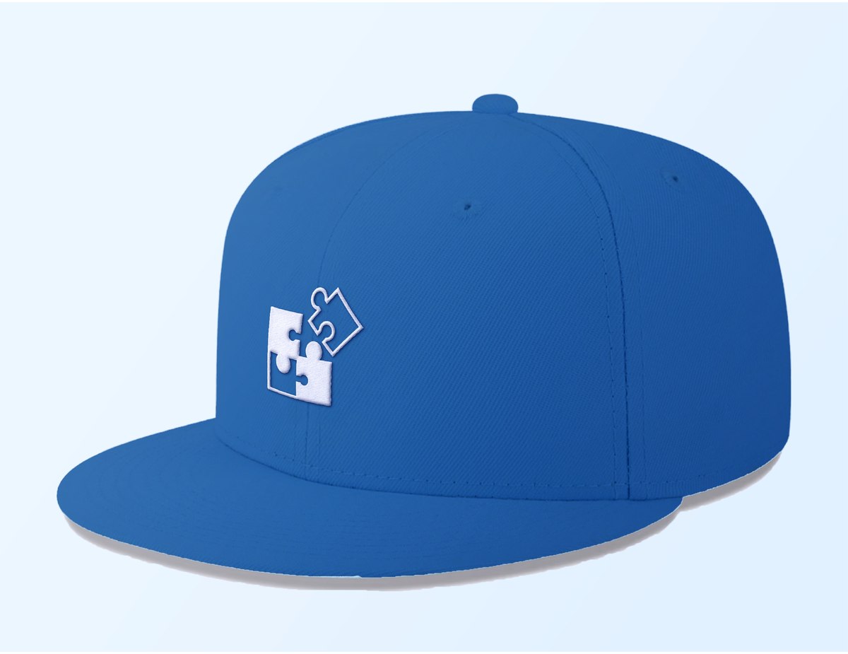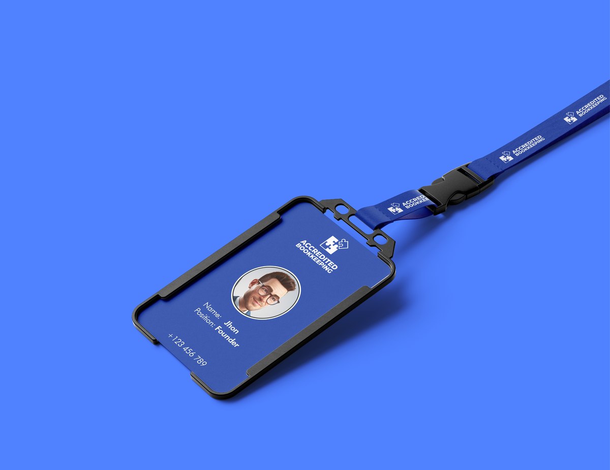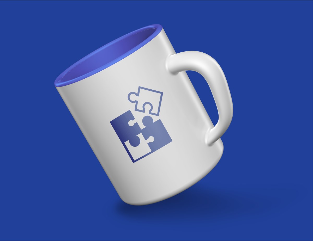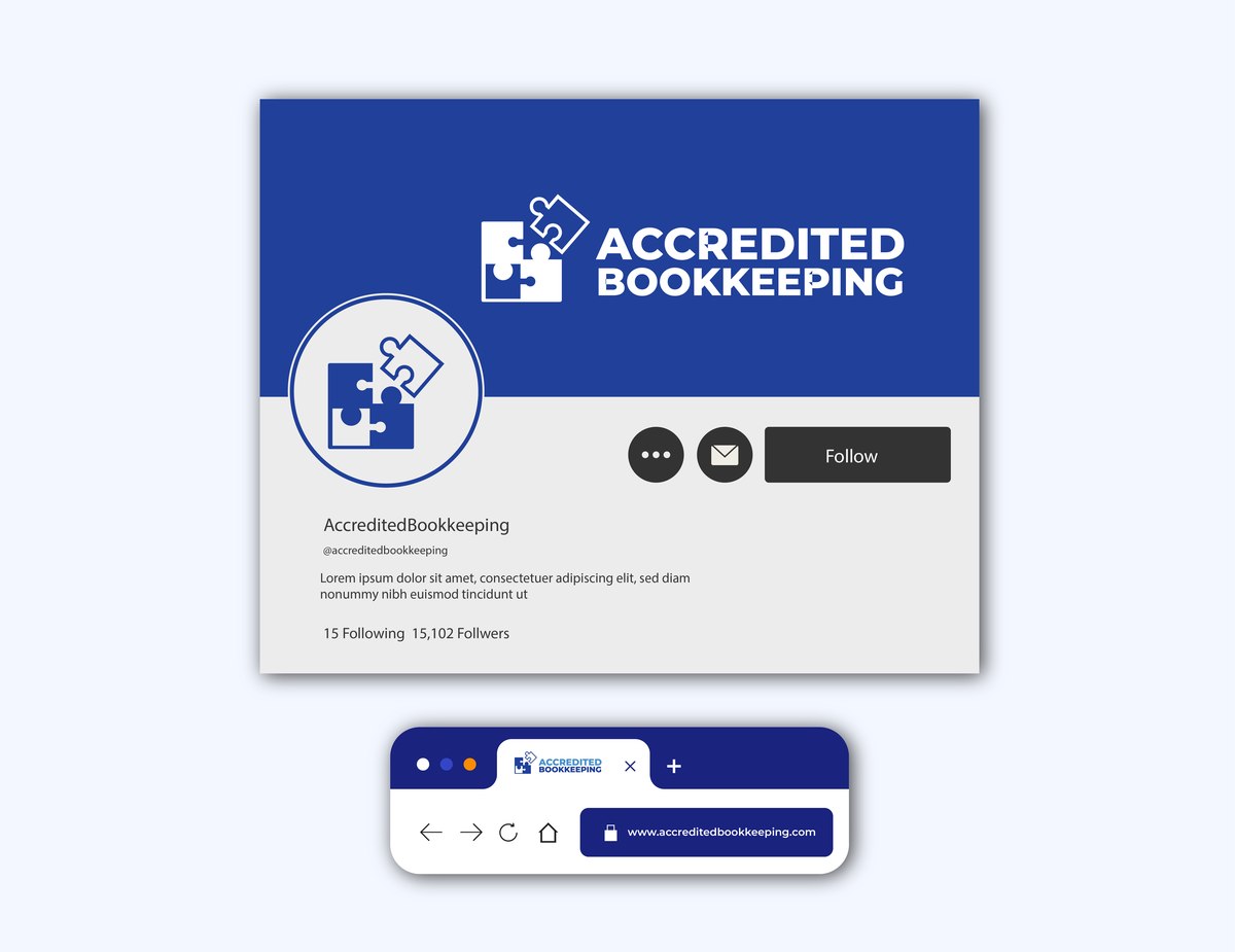
A simple, rounded mark for a bookkeeping practice, built around a puzzle-piece icon that stands in for the precision and problem-solving at the center of the work.
Accredited Bookkeeping needed a mark before it needed anything else, no existing logo, no visual shorthand a client could recognize on an invoice or a shirt. The brief called for something simple and rounded, built from a short list of symbols the client felt represented the work: puzzles, plants, trees, flowers, or cardinals, each meant to stand in for completeness and accuracy in the books. It had to read clearly at icon size and still look considered as a full lockup.
Of the symbols on the table, the puzzle piece was the one that mapped directly onto the actual work: two interlocking pieces read instantly as problem-solving and precision, and as figures balancing into place, a quiet nod to books that balance. The icon is built from simple rounded shapes so it holds its form from a browser tab up to an embroidered cap.
The palette runs on two blues set by the client's own brief, a steel blue and a deeper royal blue, backed by a soft neutral tint for backgrounds and digital surfaces. Clean, bold sans-serif type carries the wordmark so the name stays legible next to the icon at any size, keeping the whole system easy to specify correctly wherever it's printed or stitched.
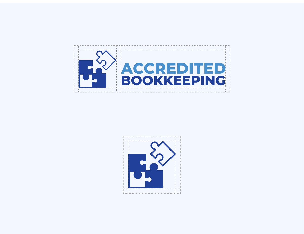
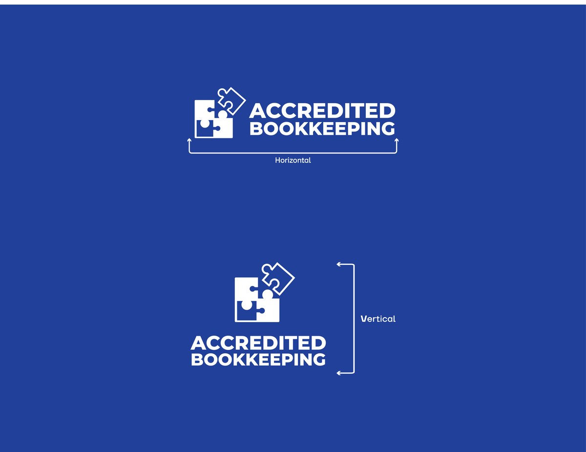
Construction, clear space, and lockup rules, so the mark stays consistent from a favicon to a cap.


A palette set by the client's own brief, easy to specify correctly on a print run or an embroidery order.
The lighter of the two brand blues, used for secondary type and accents against the deeper royal blue.
The primary brand color, carrying the icon, wordmark, and stationery with a confident, trustworthy weight.
A near-white neutral for backgrounds and digital surfaces, keeping the two blues legible without competing.
Business cards, apparel, and digital surfaces, the everyday touchpoints a small practice actually hands clients.


Symbolic directions weighed against the brief: puzzle, plant, tree, flower, and cardinal, each tested for how clearly it reads as completeness and accuracy.
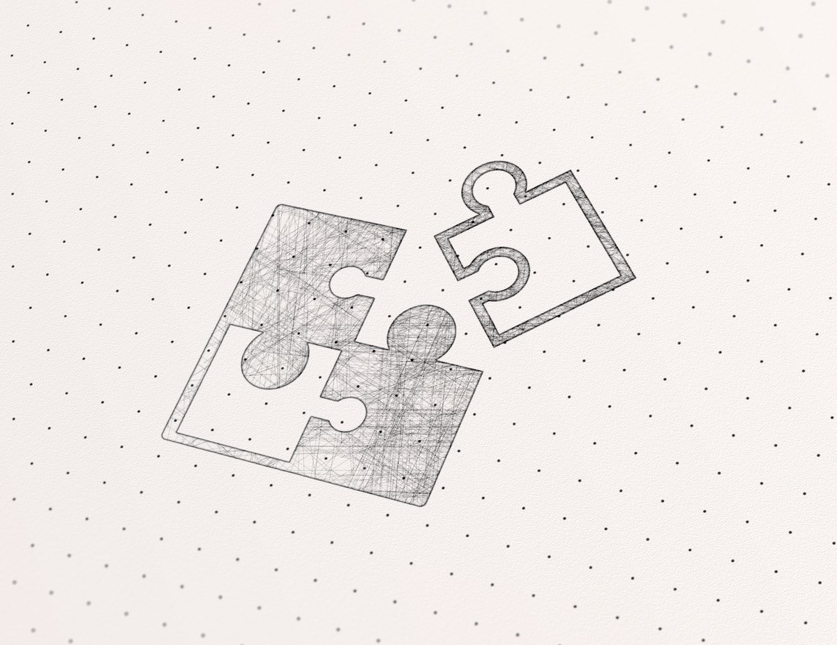
The puzzle direction explored by hand before moving to vector, working the interlock until it read at a glance.
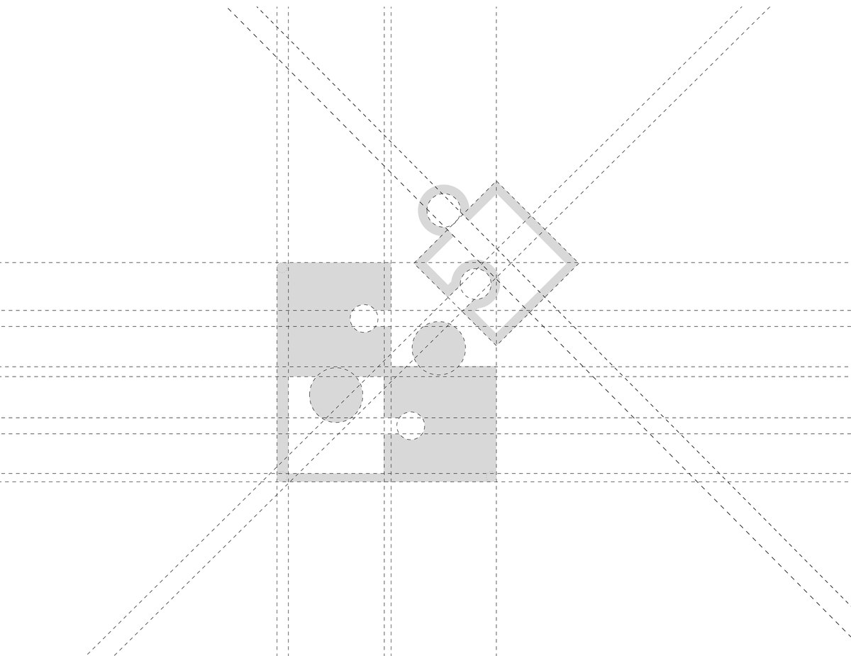
Icon refined on a strict grid, with clear space, lockup, and color rules documented alongside it.
Palette and lockups tested across stationery, apparel, and digital surfaces before handoff.
The result is a small, self-contained mark Accredited Bookkeeping can put on an invoice, a shirt, or a browser tab and get the same brand back every time.