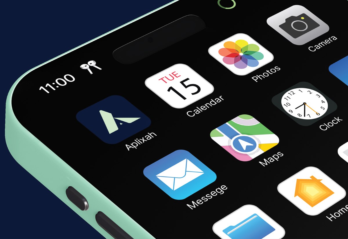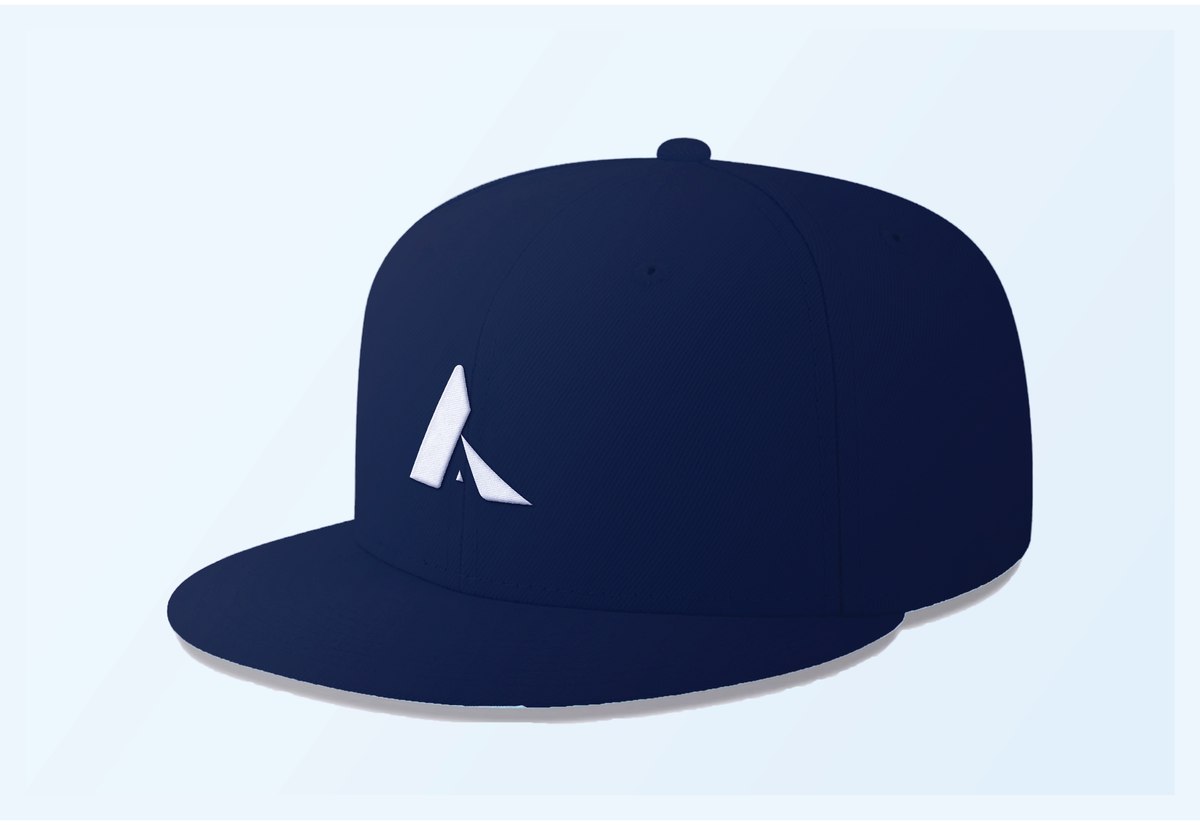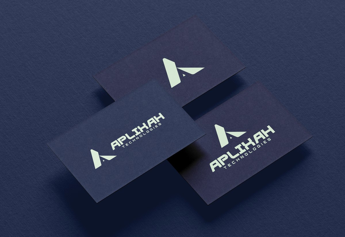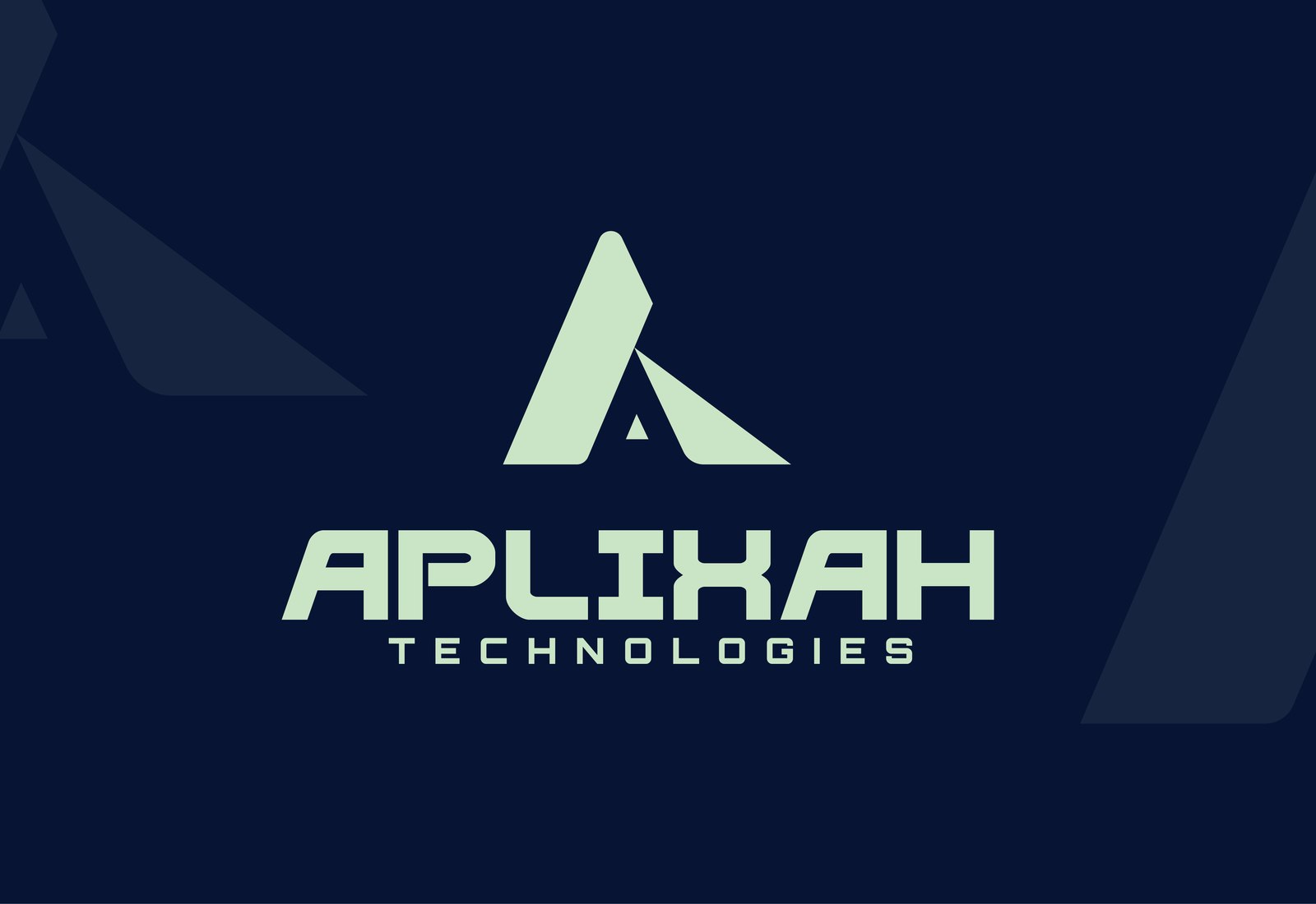
A bold lettermark for a Kenya-based technology company, fusing "A" and "T" into a single unified mark built to read as clear and future-ready from an app icon to a business card.
Aplixah was building a technology company around innovation and smart digital solutions, but had no mark to put in front of clients yet. The logo needed to do more than label the company: for a business pitching a future-ready, digital-first identity, the mark itself had to demonstrate that clarity and confidence on sight, and hold up cleanly at app-icon size, on a favicon, or embroidered on merchandise.
The mark fuses the company's initials, "A" and "T," into one continuous lettermark: a sharp triangular ascent reads as the "A," with a second angled stroke breaking off to complete a "T" underneath. Built as a single unified shape rather than two overlapping letters, it holds its edges at any scale, from a browser tab to a cap.
A three-tone palette gives the mark room to move between contexts, a deep navy anchors it with depth and trust, a brighter teal-green signals energy and forward motion, and a soft mint keeps the mark legible when reversed out of a dark background. Bold, geometric type carries "APLIXAH TECHNOLOGIES" beneath the icon, echoing the same angular confidence.
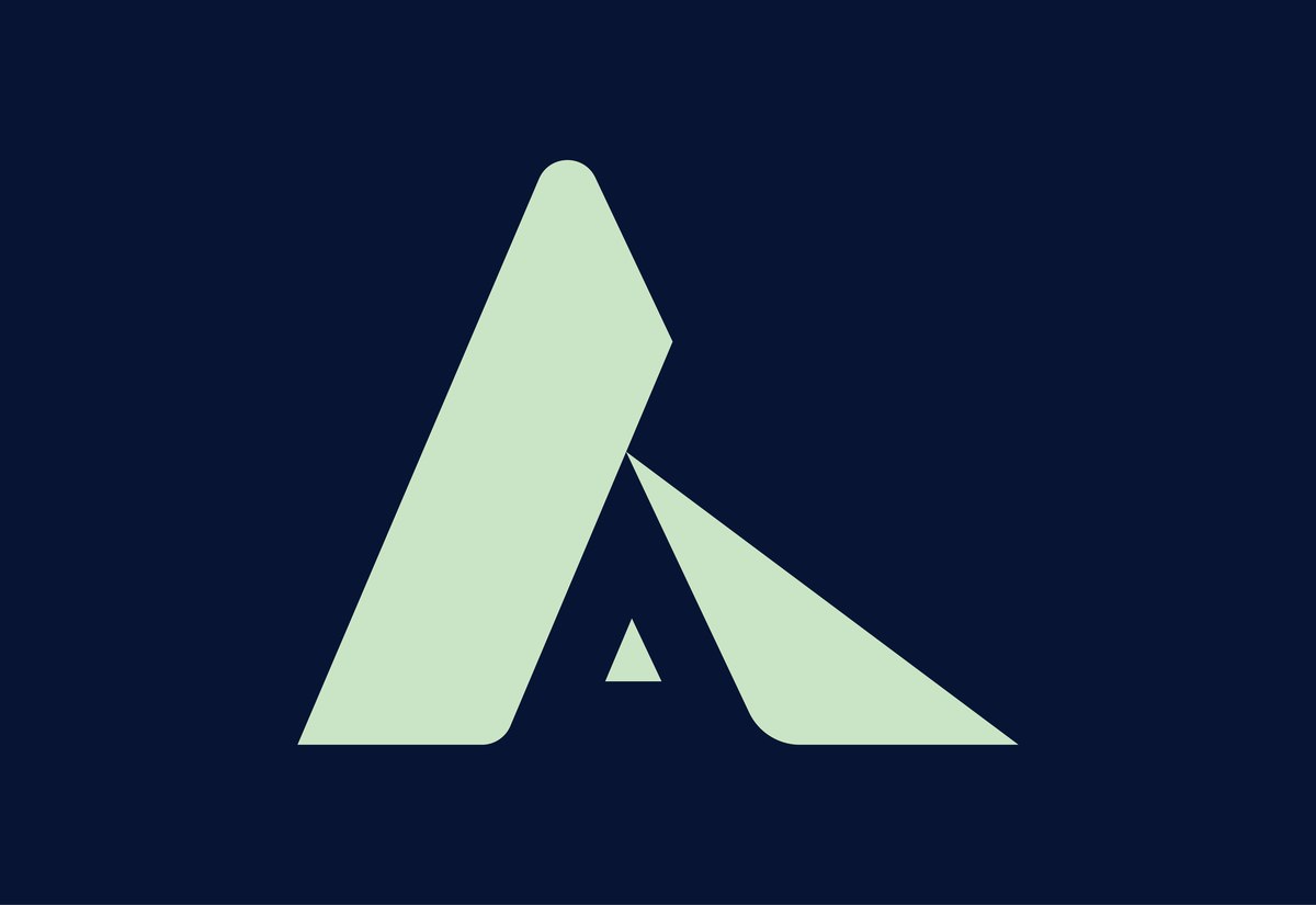
The full lockup for wordmark contexts, and the icon alone for anywhere space is tight.

A navy anchor, a brighter accent, and a soft highlight, built to move the mark between dark and light contexts.
The anchor color, carrying backgrounds and the primary lockup with depth and trust.
A brighter accent signaling energy and forward motion, used sparingly against the navy.
A soft highlight that keeps the mark legible when reversed out of the navy background.
The mark applied to the surfaces a tech company actually hands people, a phone, a cap, a business card.


Brief centered on clarity, strength, and a future-ready mindset, for a technology company entering Kenya's digital solutions market.
"A" and "T" explored as a single interlocking form until the two initials read as one continuous mark.
Lettermark refined as a unified shape, with the three-tone palette and wordmark set alongside it.
Mark tested as an app icon, on apparel, and on stationery before handoff.
The result is a single lettermark Aplixah Technologies can run from an app icon to a cap and get the same confident, future-ready brand every time.